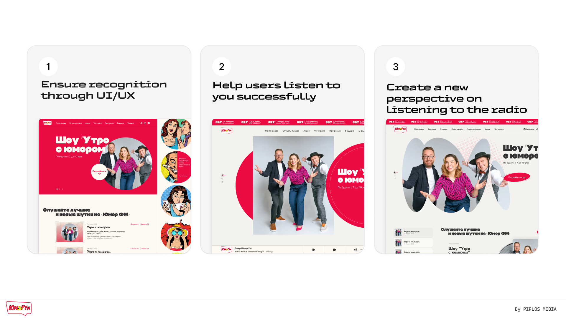
UI/UX of the Humor FM radio station website
At Piplos Media, we developed a UI/UX concept for the Humor FM radio station website as an initiative project to demonstrate what a modern, user-friendly, and visually compelling digital product for a media brand could look like.
Our task was not simply to "refresh the design," but to think through the user experience: how a person enters the site, what they do in the first second, where they go next, and why they stay.
The project was completed in the form of a concept and presentation demonstrating the logic of the interface, page structure, and possible visual direction.
What we wanted to achieve
- Simplify the user's path to listening to live broadcasts.
- Make the website easy to use, understandable and modern.
- Remove clutter and visual noise.
- Create a foundation for further development of the platform.
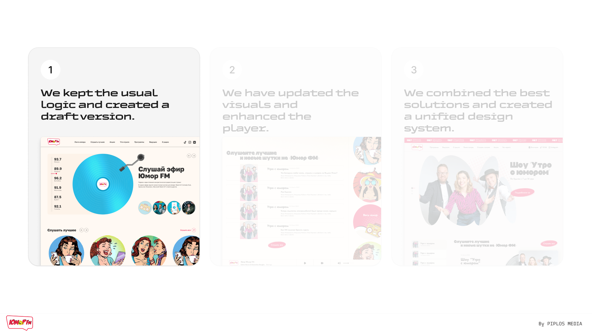
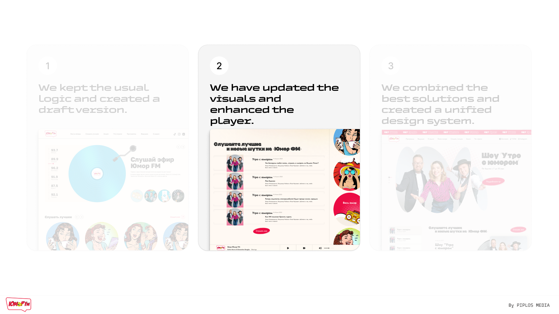
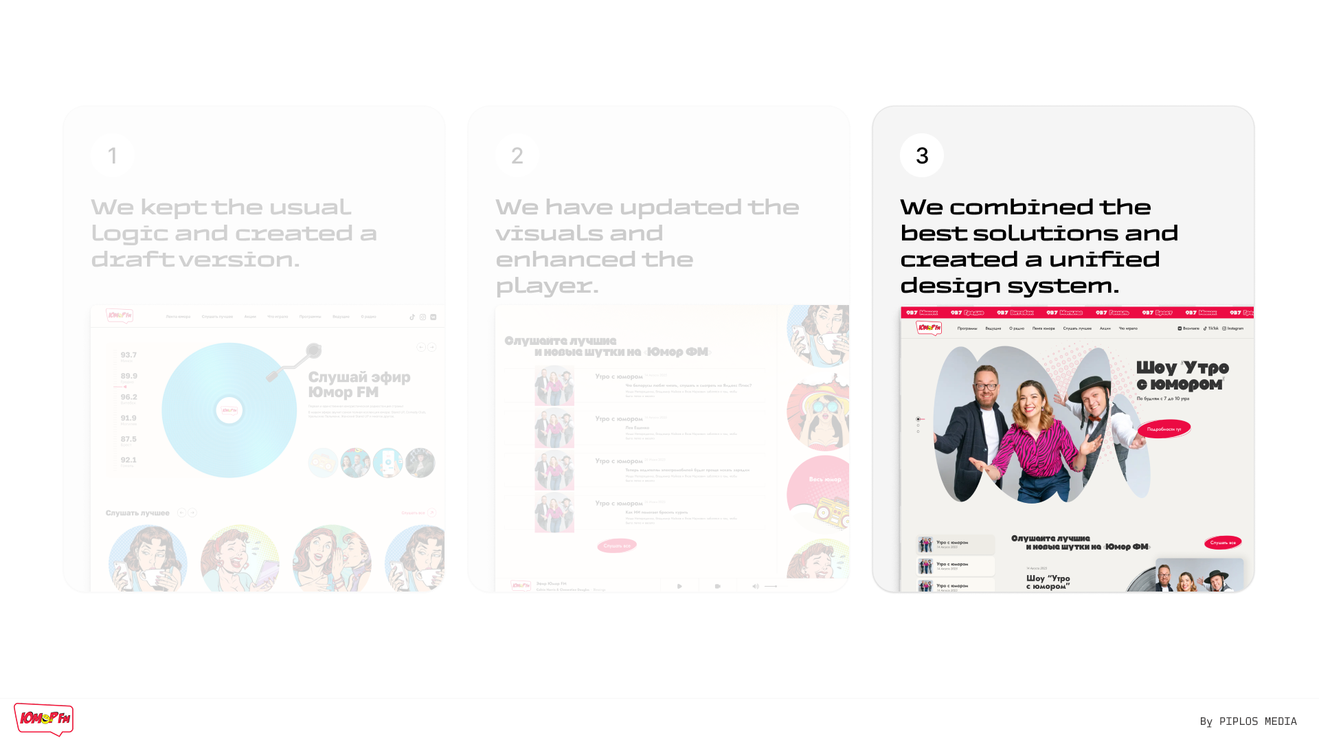
Our approach
We began by analysing the current user experience and formed several UX hypotheses. Next, we designed the page structure and user scenarios, and only then moved on to the visual aspect.
The concept is based on:
- minimalism and a clean interface;
- a clear content hierarchy;
- large clickable elements;
- a focus on the main action – launching the radio.
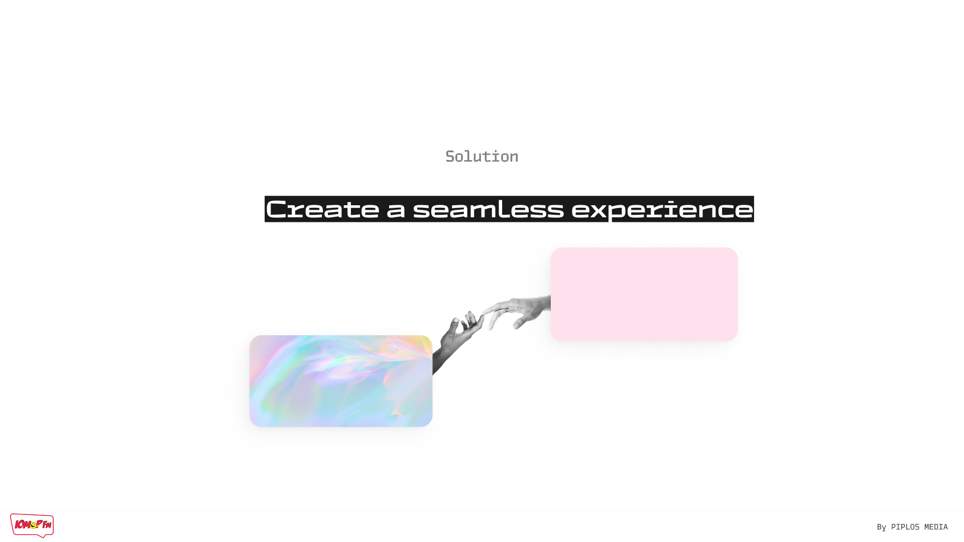
The idea is simple: users should be able to start listening to the broadcast with a single click and without any unnecessary actions.
User scenarios
The concept covers key scenarios:
- launching online broadcasting;
- switching to programmes and presenters;
- viewing news and special projects;
- exploring additional content from the radio station.
Each scenario is designed so that the user does not get lost and always understands what to do next.
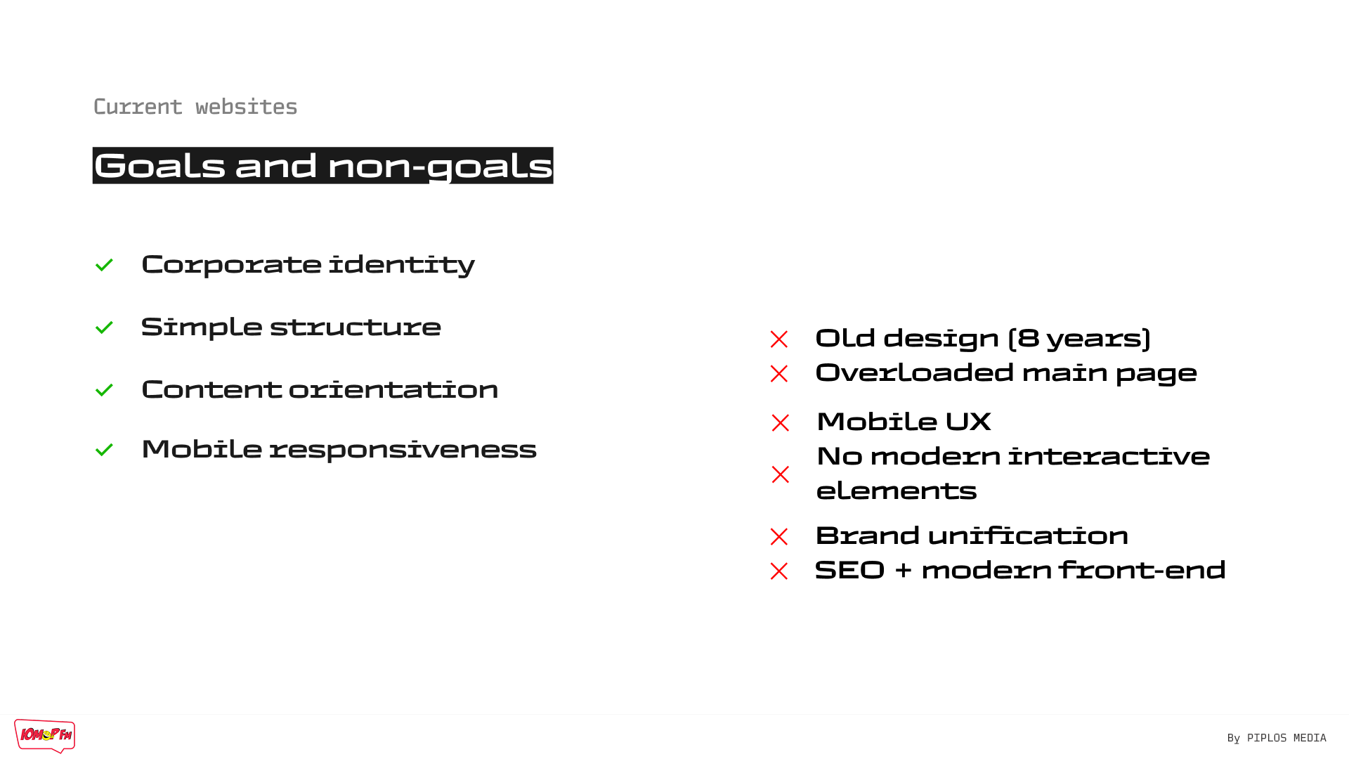
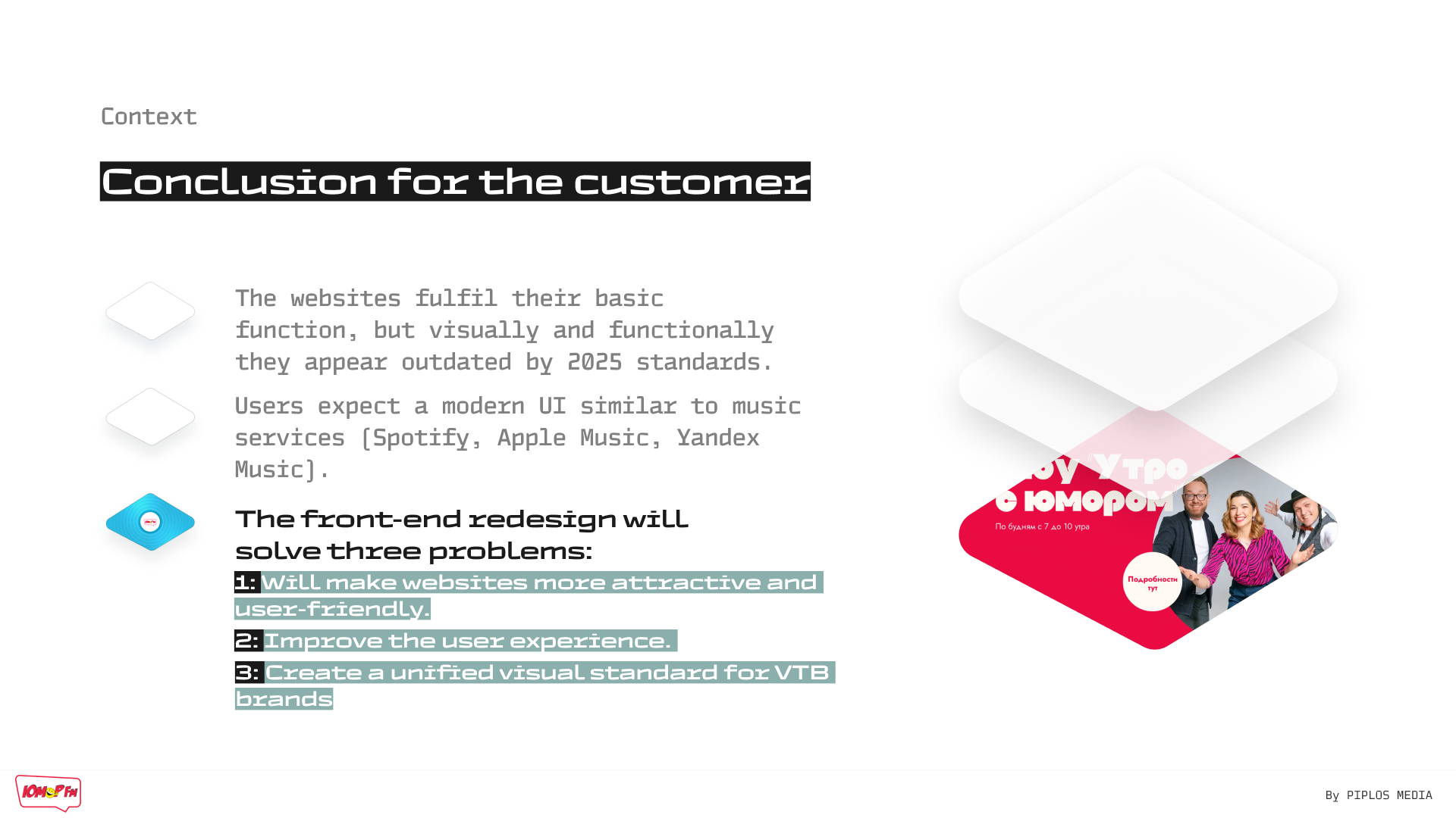
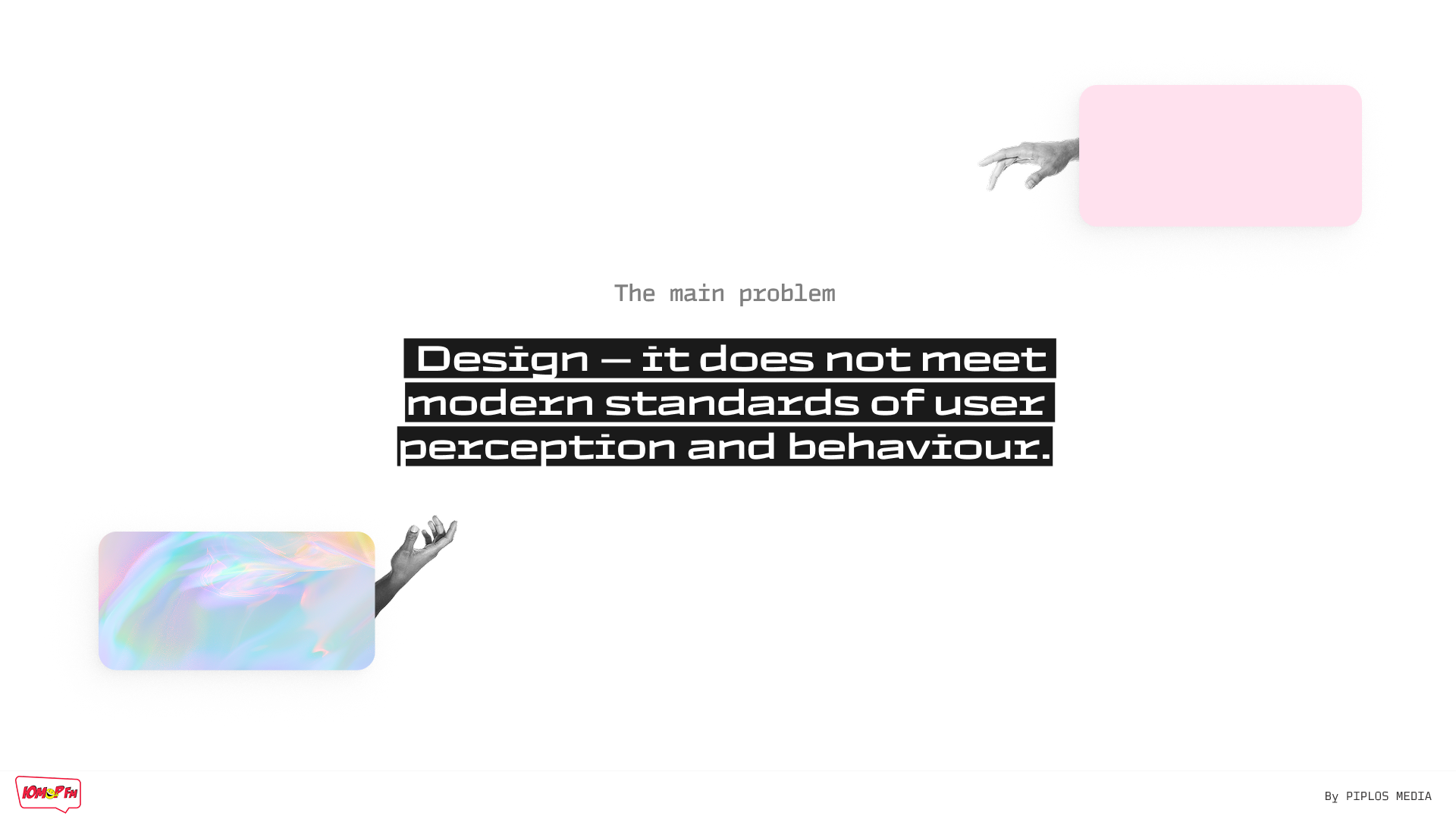
The main problems with the old design
- Visual techniques relevant to the early 2010s are used (voluminous buttons, overload of elements).
- Outdated font, icon and button styles are used that do not correspond to digital trends.
- Overload and "noise" of content.
- Low focus on the main action.
- Modern websites use small animations, hover effects, and smooth transitions to improve perception.
- There are no modern UI solutions for retention: personalised blocks ("recommended listening," "playlists of the day").
UI concept
Visually, we relied on a combination of a light background, brand accents, and expressive typography. The content is presented through cards and large blocks, which simplifies perception and makes the interface "airy."
The style turned out to be light, modern, and well reflecting the character of the radio station.
Adaptability
The concept was designed with mobile devices in mind from the outset. The interface logic is equally intuitive on smartphones, tablets and desktops - without any loss of functionality.
What has been done
- UX analysis.
- Hypothesis formation.
- Page structure design.
- UI concept development.
- Preparation of a presentation for the customer.
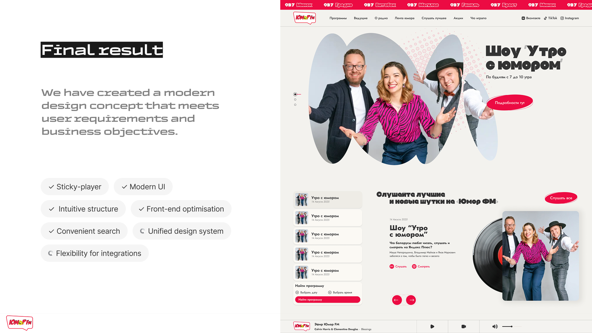
Result
We have developed a comprehensive UI/UX concept that demonstrates what a modern radio station website could look like in terms of convenience, visual perception, and user experience.
Even without implementation, this project clearly demonstrates our approach to working with media platforms and our ability to think not only in terms of design, but also in terms of the logic of user interaction with the product.