Radio station "RadiusFM"
Нами был сделано полное переосмысление дизайна радиостанции. Мы смогли реализовать смелые идеи поставленные перед нами заказчиком. Итог превзошел все ожидания. Посещаемость сайта We have made a complete rethinking of the design of the radio station. We were able to realize the bold ideas put before us by the customer. The result exceeded all expectations. Site traffic has increased several times.
The radio station is included in the "Top 10 * of the most popular radio stations in the capital and regional centers." Radius FM "is the only CHR format radio station in Belarus with 98.19% coverage ** of the country's population.
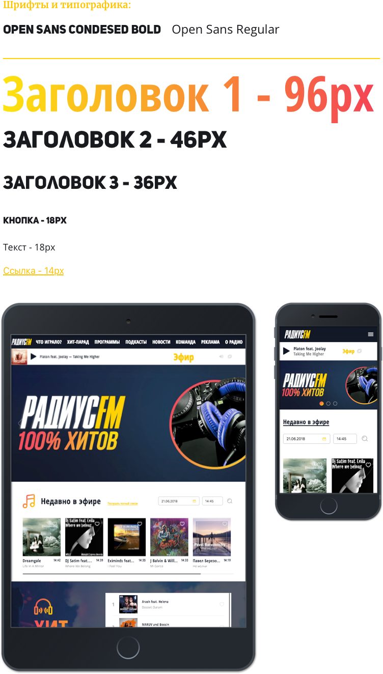
Colors :

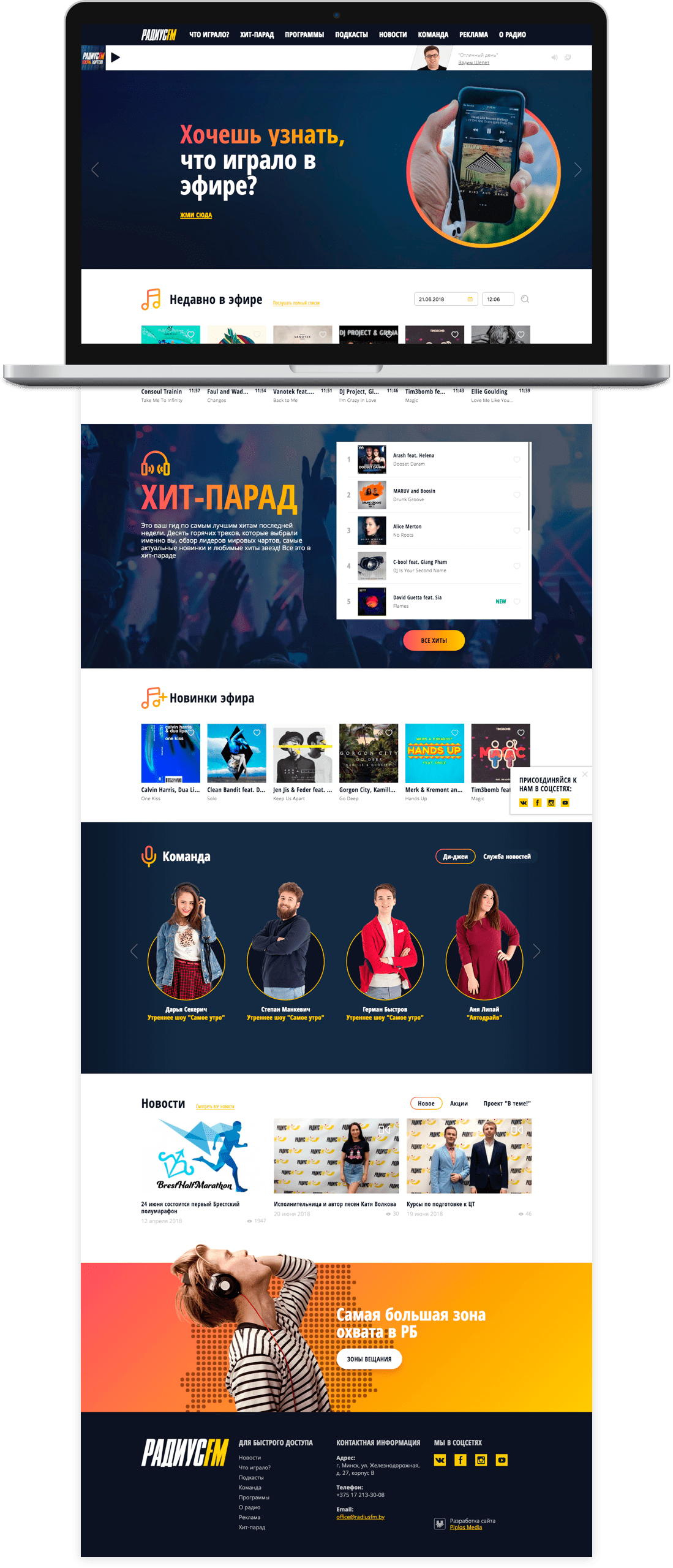
Developed mobile devices, created for all permissions:
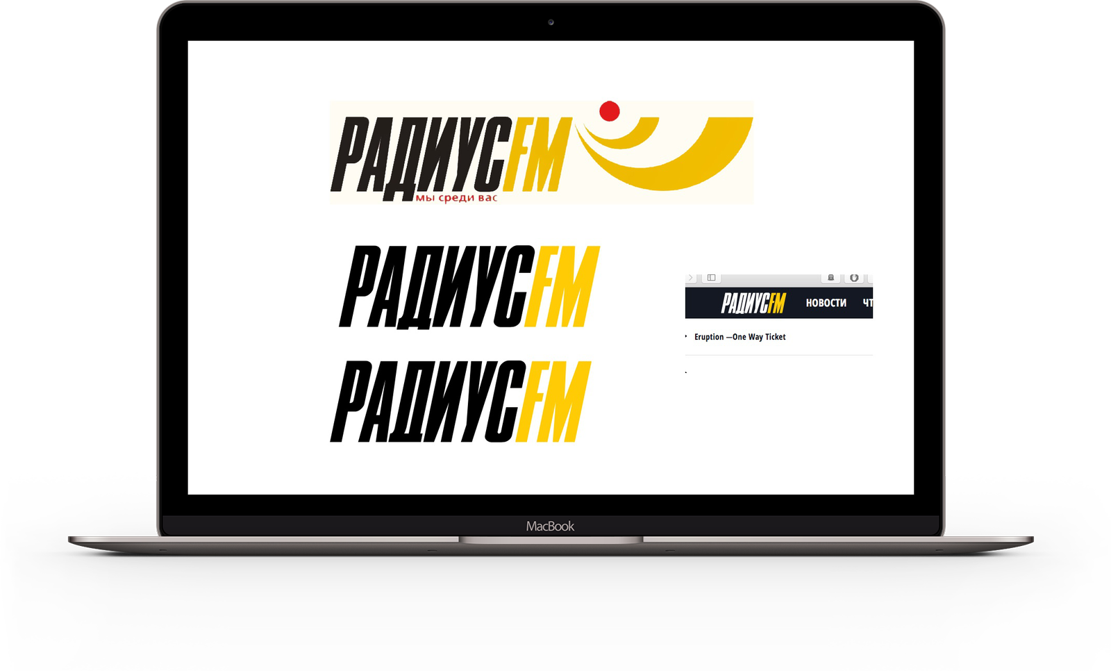
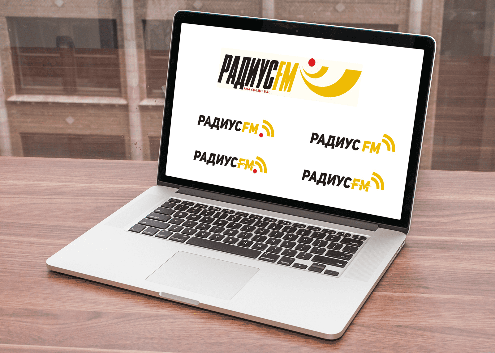
n particular, we prepared a new version of the logo of the radio station.In
this project, the development of the logo was formed on the basis of accepted that website design.
As such, we were unable to obtain input from the customer except for some facts that needed to be taken into account:
- It’s fundamentally important - the word "Radius" - in Russian letters, FM - Latin.
- I would like to maintain continuity with the old logo. So that when you look at the new logo, elements of the old are recognized.
- In no case do we try to reduce to three letters - PFM, etc.
Based on these comments, we made the first draft:
After the first option, which was rejected by the Customer, we received a number of additional information:
- Maximum similarity to initial logo. We do not come up with a new one, we rethink the old. We make it more modern, recycle it. “Perhaps we like italics.”
- Maybe some special element will be some kind of letter that will create a recognizable style?
Next, we presented a revised original version with simplification of the main font and redrawing the idea of waves:
Next, we received a number of comments on these options:
- We do not like the font .
- A very heavy letter D, which in tandem with the letter A breaks the logo, a large space appears.
They left again for reflection and after that the final version was born. In it, we decided to use minimal changes to the current logo. Essentially we are saving it by changing a bi.