As part of the project, the first version of the homepage design was developed.
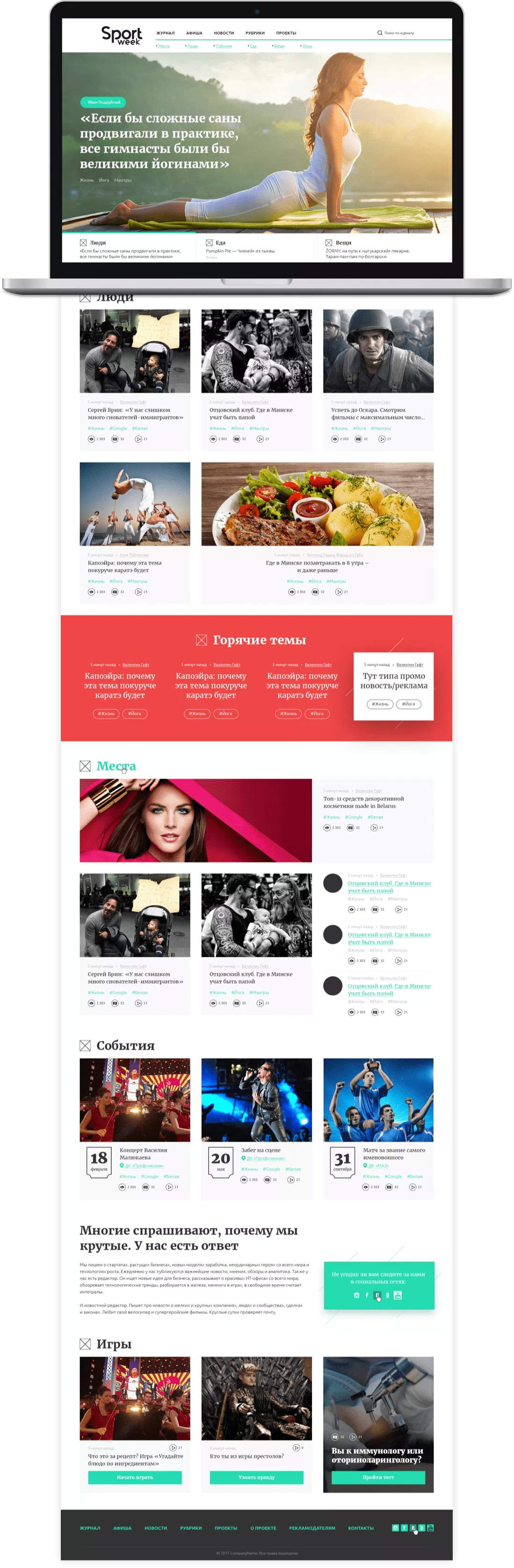
The concept included more advanced project functionality, as well as a more complicated structure, which would allow to expand the target audience.
This option was rejected by the Customer with an explanation about the simplification of the structure and ease of perception of information. There should also be a brighter display of "Branding" pages.
After that, we went to rethink this project. And soon they provided a new version of the visualization of this project.
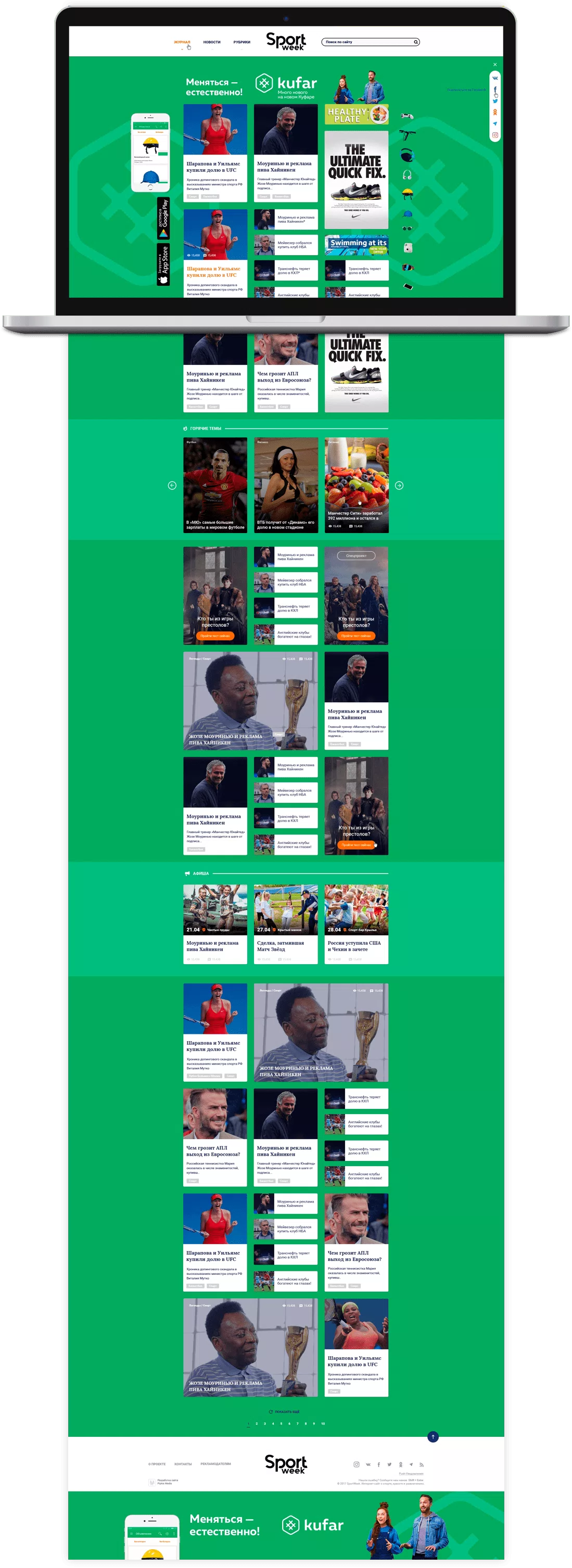
On the second attempt, we hit the target!
The new structure of the site implied a simpler functionality of the project, but a complex system of branding sections.
Each section individually had the possibility of branding, based on which the page structure was grouped in such a way that as much as possible space was allocated for this branding for display.
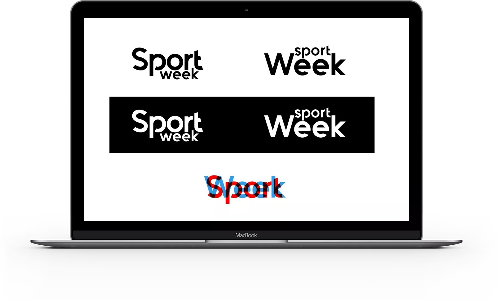
Also in the framework of the project, we have developed and implemented the logo of this Internet Journal.